The Making of Be Kind To Yourself (post-mortem)
While the game is still fresh and I’m tuning small things about it, I wanted to write down a bit of a post-mortem for a while. I waited for the itch.io release so that I could post it here.
1. The game was mostly done by March 26th
Most of the development happened in March. I submitted the finished game to Catalog on March 26th and waited a while — they were fast! I got approval in two weeks and the game launched on May 7th.
Since March 26th I still made many smaller changes but mainly focused on promo art, trailers, and rebuilding my website mouflon.cloud into a hub of all info about my games.
I had some feedback from playtesting and a lot of feedback after release — so I’d say I spent more time working on the game since March 26th, but most of these changes are noticeable only after very close inspection.
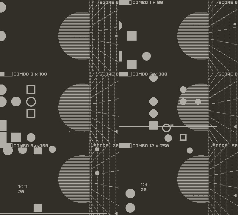
Early gameplay without fail states and most of the visuals. Thanks to the background and my decision to keep the clean geometric shapes, it already looks quite similar to the final game.
2. It started as a crank-first game
I wanted to use a full-circle crank control bound to the vertical axis so that a full rotation makes the player character go fully up and down. I liked being able to play with the crank in front/back and bouncing off the edge by going past the top/bottom positions.

While developing the game, I soured on the idea. The movement was precise but too heavy-handed and felt uneven because of the linear mapping of circular movement to a flat screen. I considered adding some curve to the controls but that felt even worse, so I defaulted to d-pad for most of the development.
Only after submitting the game and getting some air, I realized I could add dead zones to the crank — making the crank move more quickly along a shorter path.

Those made the crank the best option again and it seems that most players use it as default.
By the way, this is why the game scrolls to the left (or up). I wanted the pointer/character as close to the crank as possible. (The “crank up” screen orientation breaks this, though. There’s more about the vertical mode below.)
3. It started as a rhythm game
The other thing I wanted to try out was rhythm-based gameplay. Back in ’22 I made a small jam game with a cool track from Seth Walker and while searching for something, I discovered he has a whole set of 120 BPM tracks listed under CC0. I thought that a set of songs that are easy to stitch together would mesh well with the combo-based level design I loved in Pix’n Love Rush.
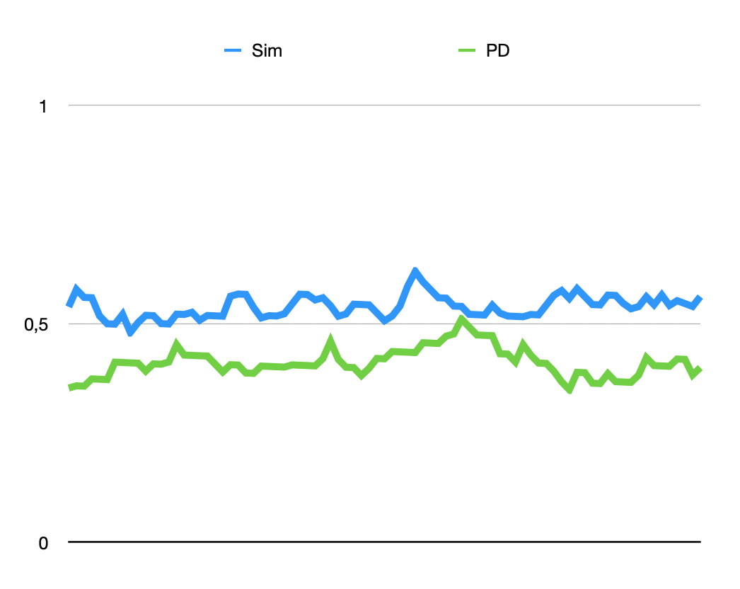
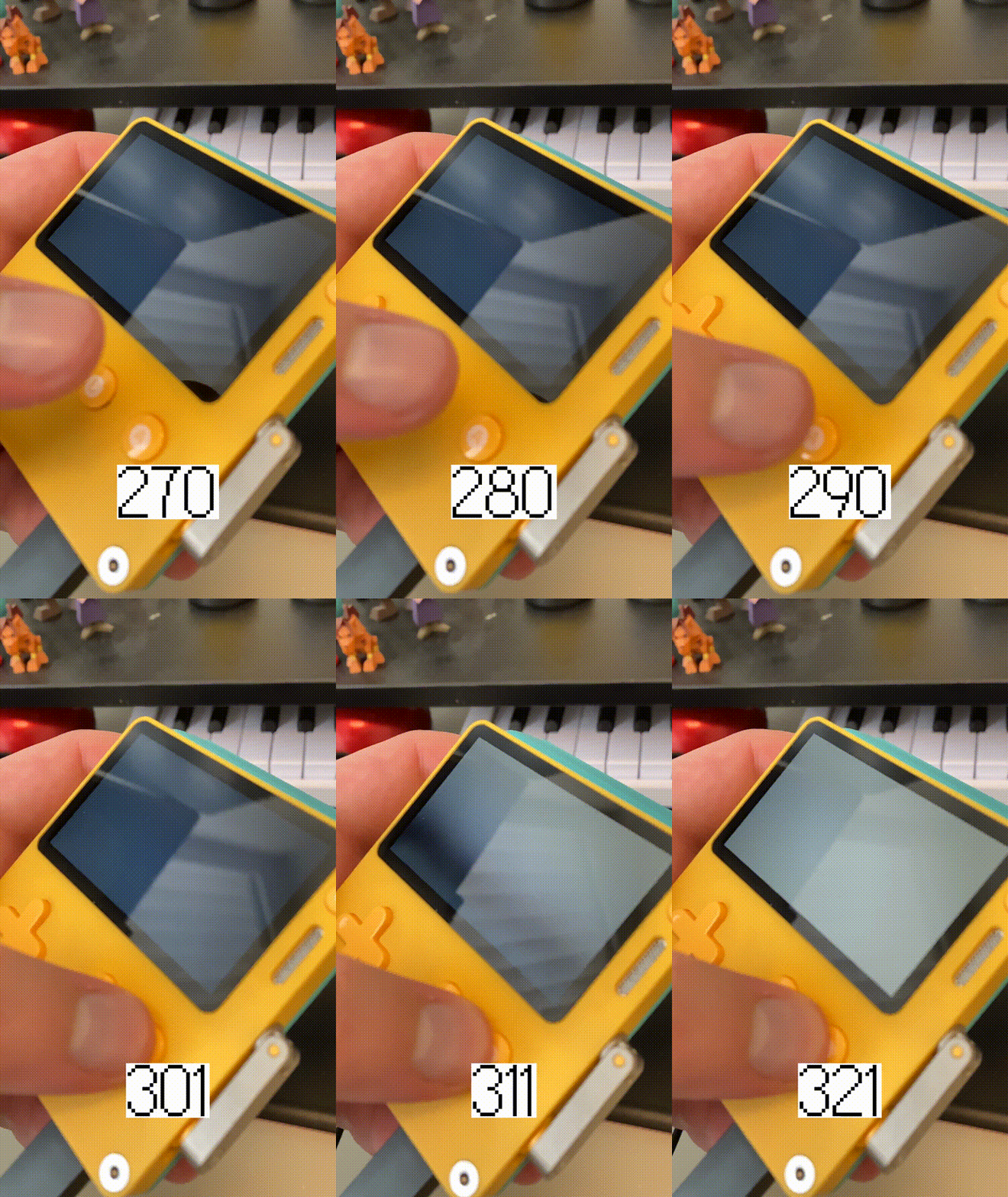
While designing the game, I crashed into an issue — the inputs seemed to be delayed when playing on the device (as opposed to testing in the Simulator on my PC). I even posted about it on the Playdate Dev Forum before a friend pointed out that it could be because the songs sound differently and it’s hard to hit the beat without that sweet bass. And indeed, with headphones, it was all good even directly on a Playdate.
I’m always happy to debug in overly complicated ways :)
I didn’t see an option to make it all work — the shift is not uniform and depends on sound dynamics in every song. So I added a hefty time buffer around the beats and made the rhythm mechanic a secondary gameplay element.
4. Lasers save CPU power
I wanted precise controls and smooth rendering. This meant setting fixed 50 frames per second (the maximum with Lua) and avoiding too much math. Checking a line of sight is much quicker than checking collisions between the stones and projectiles, so I chose the laser.
The space theming, the ship, and all the lore came only after that.
5. An experiment with scope creep avoidance
Back in March, I needed a win. I wanted to complete and release a game. Gotta Bounce was far from finished and I just a lost a big client in my freelance work. With Matt Septhon, we were close to releasing Kye (as we still are, lol).
As I read Matt’s article about developing YOYOZO, I was immediately inspired. Specifically, I really liked his single-month development timeline. Is there an idea that I could bring from prototype to Catalog submission in a month?
I love the details on everything I make and that makes me really vulnerable to scope creep. Adding a tiny polish may actually devolve into a feature. And you don’t want features while on a deadline :) I decided to create a prototype quickly and then only remove what did not work instead of adding new things. And I mostly succeeded in that.
The only thing that I kept despite being super-annoying (GAH!) and adding a lot of work would be…
6. The vertical mode
I had the vertical mode (or tate mode) in the game since a very early prototype phase. I love how the game looks in that mode but I didn’t want to force that on the players, especially because it’s kinda hard to find a solid grip on the device.
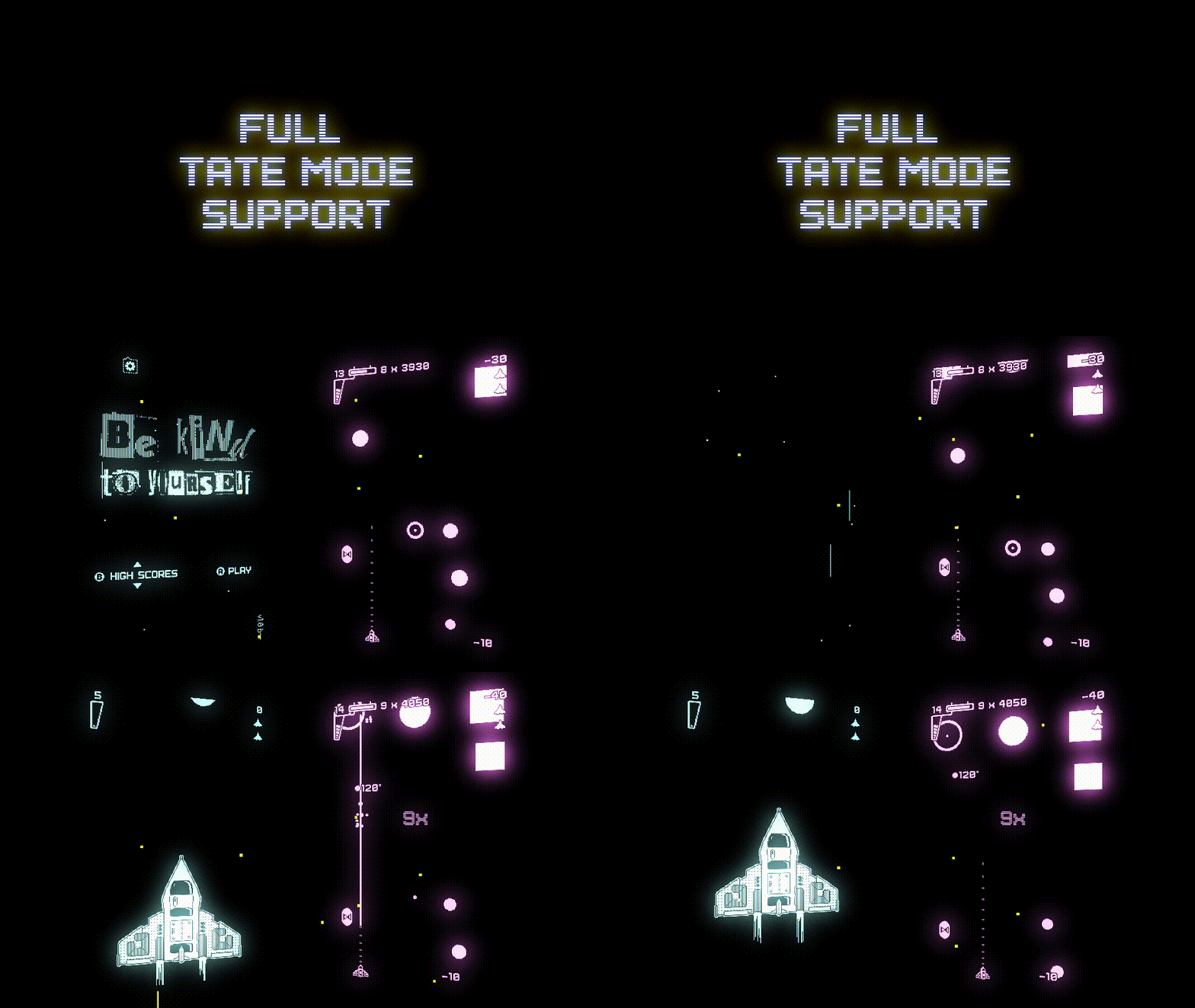
However, supporting the mode throughout the game is pain. I decided to go all the way — if a player wants a vertical game, there shouldn’t be a trace of horizontal in it. So… all the menus, tutorials, every text, icon, or effect… are done twice (or even three times as some things depend on the button layout). There are also minor annoyances when using it because you can’t rotate the system menu.
This hurts prototyping when solving issues and also adds an extra checkbox to every task. It adds a ton of inter-dependencies between the components because everything that has icons or text needs to read game state and provide double rendering. I hated it profoundly at some points in the development.
I’m still happy that the game has the mode and that I managed to really go all the way to 100% on that.
But I wouldn’t go that route next time.
7. GOAT formula was a last-minute decision
I requested an extra scoreboard before knowing what I’d do with it. My initial idea was to just plop every new player on the scoreboard. Just to be able to display an “achievement” notification right after launching the game — you become the GOAT just for playing the game. You don’t need to do anything else, because I love you just the way you are. I liked that as a play on the name of the game and a tiny way to bring a smile to the player.
After a few weeks, I decided against it, as it felt to me like unnecessary data collection. Which is one of the darkest shadows looming over the tech industry. What a tone change, lol.
I wasn’t sure what to do with the board after that. The last week before submitting the final build, I decided to make it a board with single-digit numbers that are computed from all the other scores (after a single run). Only players who reach a score equal to or bigger than 1 are accepted.
So far, four people achieved the GOAT status — all of them are featured in the “nice things people said” trailer, though one of them went from a score of 3 to 43 since the trailer premiered.
The formula was broken for a few days after the Catalog release. I did make sure I was not sending a huge number to the online scoreboard (by dividing the number by 10^12, hence the tiny numbers) but I did not test it enough to realize that Lua will break when working with a huge number like that anyway.
8. Tic Tac LMAO
I played with some of the shape-matching mechanics early, so my initial name ideas were “TIC TAC LMAO” (my project folder is still named “pd-ttl”) and “Beat Tac Toe”.
After adding a game over soundbite that says “Please, remain calm”, I considered using that as the name of the game, but there were many other things named exactly like that. “Be Kind To Yourself” was the next similar name I tried googling and the results looked much less crowded. I liked contrasting it with threatening visuals.
The initial logo was ready after a few minutes and I put it into the game the next morning.
9. Itch.io release considerations
With Stars of the Screen, I had a version 2.0 DX ready when Catalog launched — it was on Itch more than 6 months by then. I liked that because I wasn’t afraid that the game would have breaking bugs or other problems.
I considered releasing an early version of BKTY on Itch.io but due to the focus on score chasing, the experience would be lacking for the more competitive players. And I didn’t want anyone to buy the game twice just to get access to scoreboards.
For players, Catalog is a much smoother experience. From the dev standpoint, it’s mostly great, too — Panic takes care of a lot of stuff and even promotes the games, too. However, the distance between player and dev is much bigger there — there are no reviews, ratings, or forums on Catalog. I miss the comments and reviews on itch.io — these can be hurtful but often deliver a sharp critique of the game that’s useful for me and the game, too.
I have a thread about the game on the Playdate Squad discord server. The reach of the server is limited (not all players are there), the specific game threads can be hard to find, and it may even seem rude to post harsh feedback in a mostly fan-dominated thread. I still get a lot of feedback there, but I feel like something is missing.
In the end, I decided on a staggered itch.io release to make it clear that the primary version is the one with online scoreboards. I posted the game a bit cheaper here, too, because of that. I don’t expect too many sales here, but it might be interesting for players who care about the boards, or for those who for some reason cannot use their card on Catalog with my games (due to how Catalog works, the cards need to be usable in a region where the dev lives).
Aside from all that, I think that being on Itch.io may also increase the visibility of the game and perhaps bring some people over to the Catalog version.
10. Playtesting is always the king
Due to limited resources, I wanted to manage risk mostly by making the game simple. I refined the core gameplay over two weeks, playing it all the time myself and in the evenings with my wife, too. But you still need feedback from players to really know anything. A few of my friends tried out the game and gave me a lot of great feedback.
However, I’m still finding new ways to make the game better a month after release. Recently I added an animation that better communicates how and when a combo score gets added to the total, and today I’m preparing an update that will make it easier to recover after a ship is lost in an explosion.
Well! Making this game was a lot of fun! Now I gotta get back to Gotta Bounce — with all this new experience, it should be a bit easier than before.
Thanks, everybody for playing and talking about the game! Playdate is cool and its community is even cooler. I love it here.
Files
Get Be Kind To Yourself
Be Kind To Yourself
Puzzle arcade game running at 120 beats per minute.
| Status | Released |
| Author | Mouflon Cloud |
| Genre | Action, Puzzle, Rhythm |
| Tags | 2D, Arcade, combos, Playdate, Score Attack, Shoot 'Em Up, Side Scroller, Singleplayer |
More posts
- Update 1.6 changelog: bugfixes and QoL improvementsMar 11, 2025
- Bugfix release 67: Blast vs laser bugDec 14, 2024
- Update 1.5 changelog: time to 100k bugfixOct 25, 2024
- Update 1.4 changelog: recovering from a lost ship is now easierJun 11, 2024
Comments
Log in with itch.io to leave a comment.
Really interesting devlog and a great addictive game!